Sample Work

I’ve done a wide range of work, from logo touchups to complete rebrandings, including new websites and signage. Below is a sampling of client work to give you a feel for what’s possible.
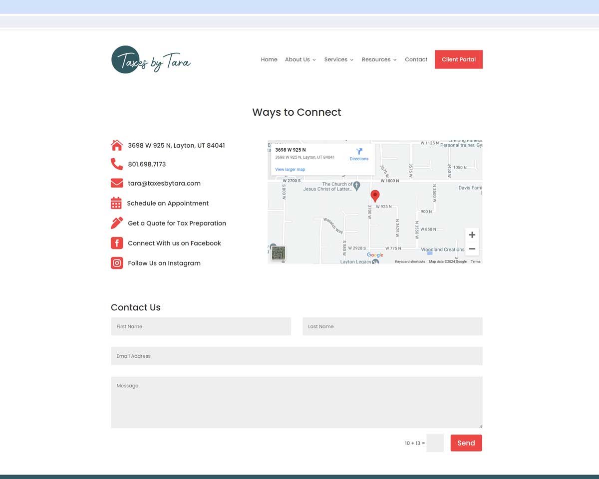
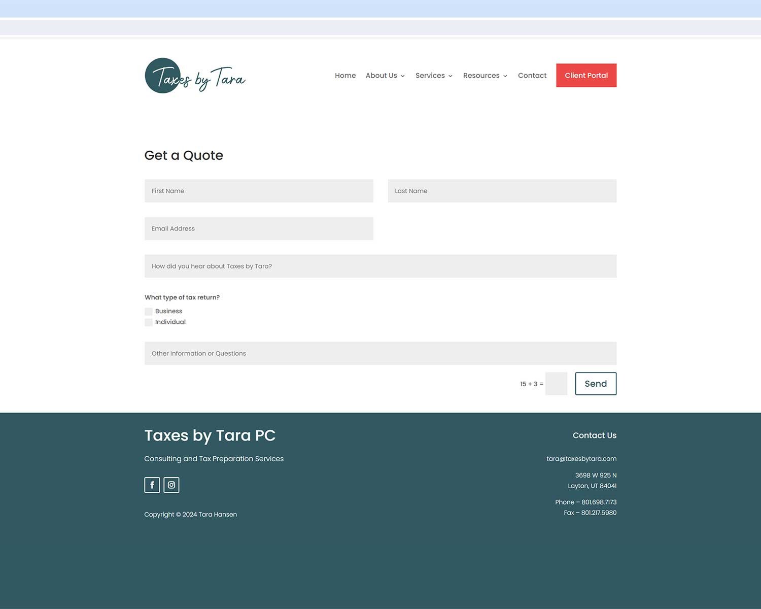
Taxes by Tara
Tara is a business owner who came to me for design help for her accounting business. She loved the colors and and fonts of her original logo (shown below) but wanted a more polished and cohesive look.

After several rounds of development, we settled on the new logo and logomark below.


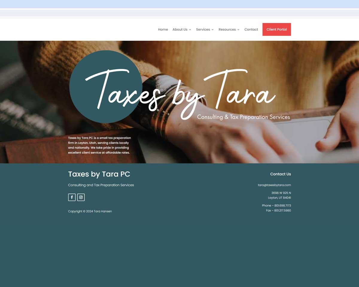
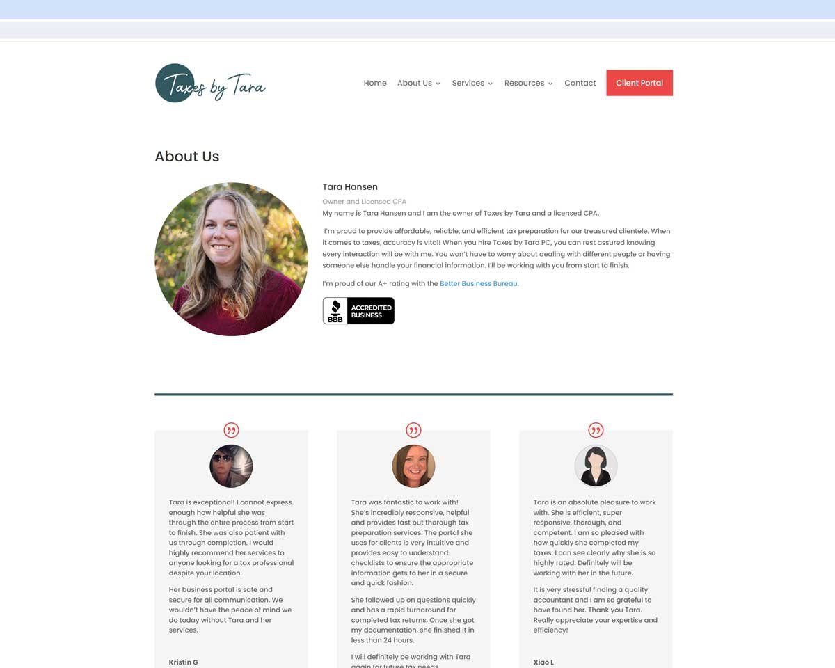
We proceeded with a full website design, ads, letterhead, banners, business cards, etc.

Logos















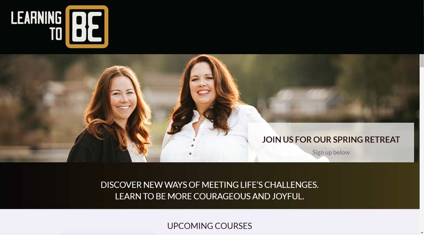
Learning to Be
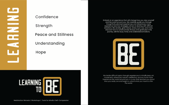
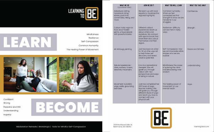
Learning to Be is a company that focuses on mindfulness and self compassion. They offer workshops, training, and retreats to teach participants tools for a fuller and more meaningful life.
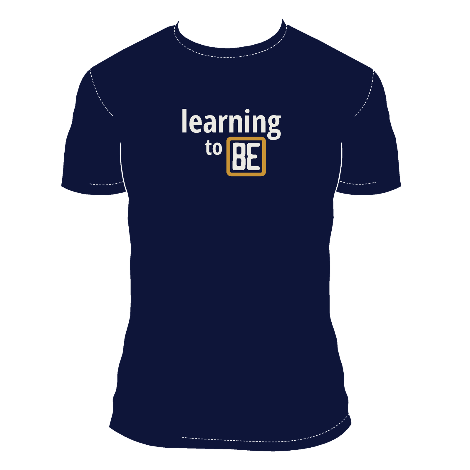
They contacted me to design a logo to be used on their website and print materials. They wanted something professional and inviting that would appeal to both corporate and individual clients.
The design process took several weeks and involved a lot of back and forth to get something that perfectly represented their brand.
I designed the logo and helped develop print materials. Web design, using my logo, was done by a third party vendor.



Mercer Island Orchestra Boosters
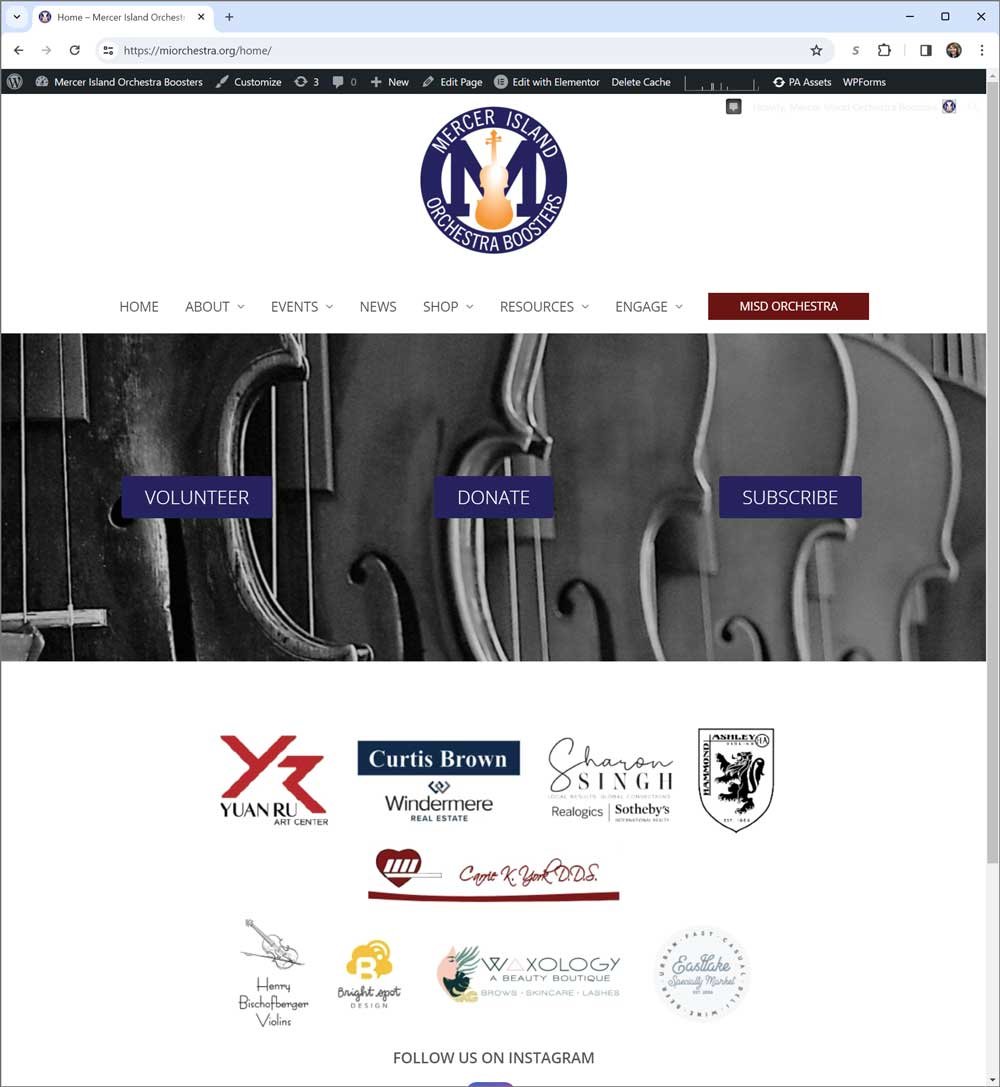
Team-O, a parent-led non-profit supporting Orchestra on Mercer Island, came to me for help with rebranding.
We settled on the name Mercer Island Orchestra Boosters and the URL miorchestra.org.
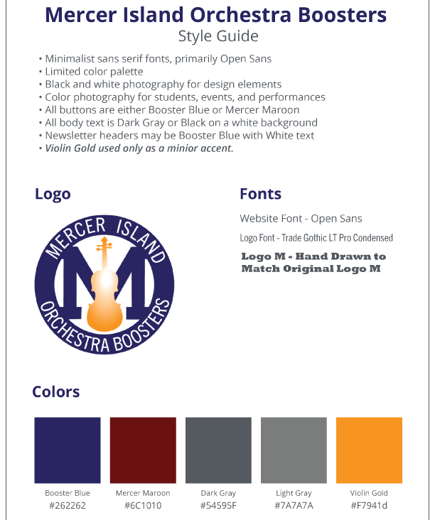
They wanted a logo to match the current Orchestra department logo. So I took the burgundy student logo and created a blue logo with an elevated violin image to represent the parent group.

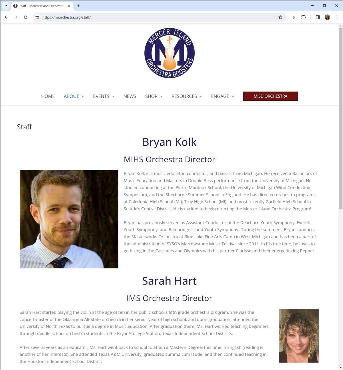
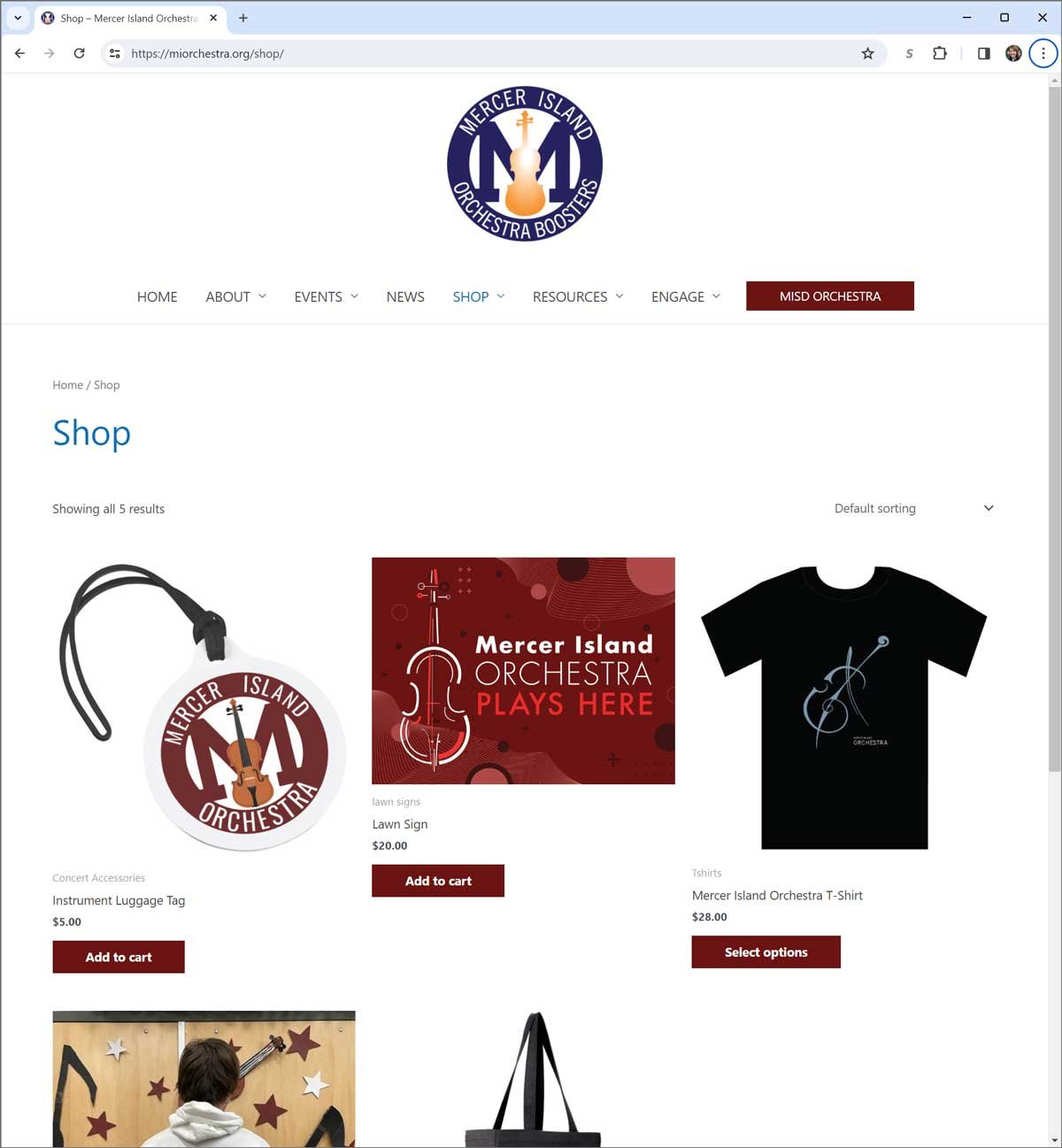
We went on to create a new style guide and do a full website redesign and I continue to work for them, creating signage, printed materials, and online assets.
Print Layout
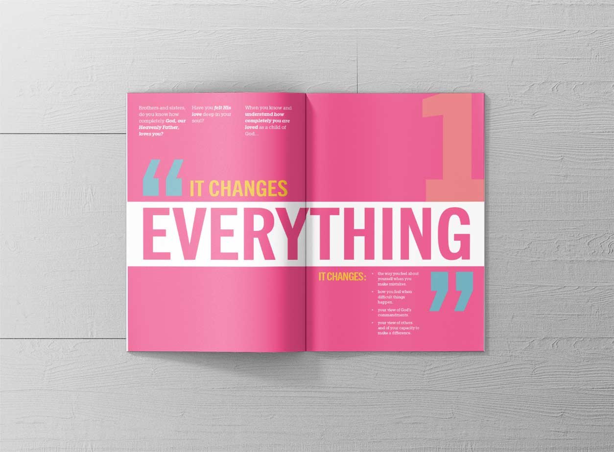
A class assignment from design school, this booklet demonstrates how good design can elevate simple text.
The design brief asked us to choose a talk from the most recent General Conference of The Church of Jesus Christ of Latter-day Saints and compile it into a gift booklet with a specific audience in mind. The document was to be beautiful, legible, creative and use typography as the major design element.
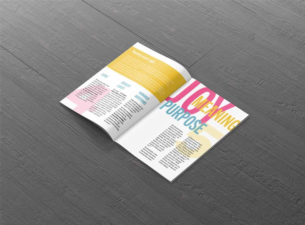
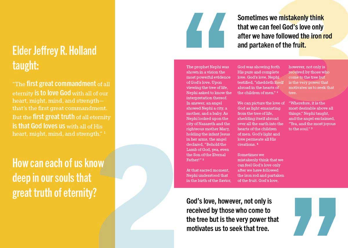
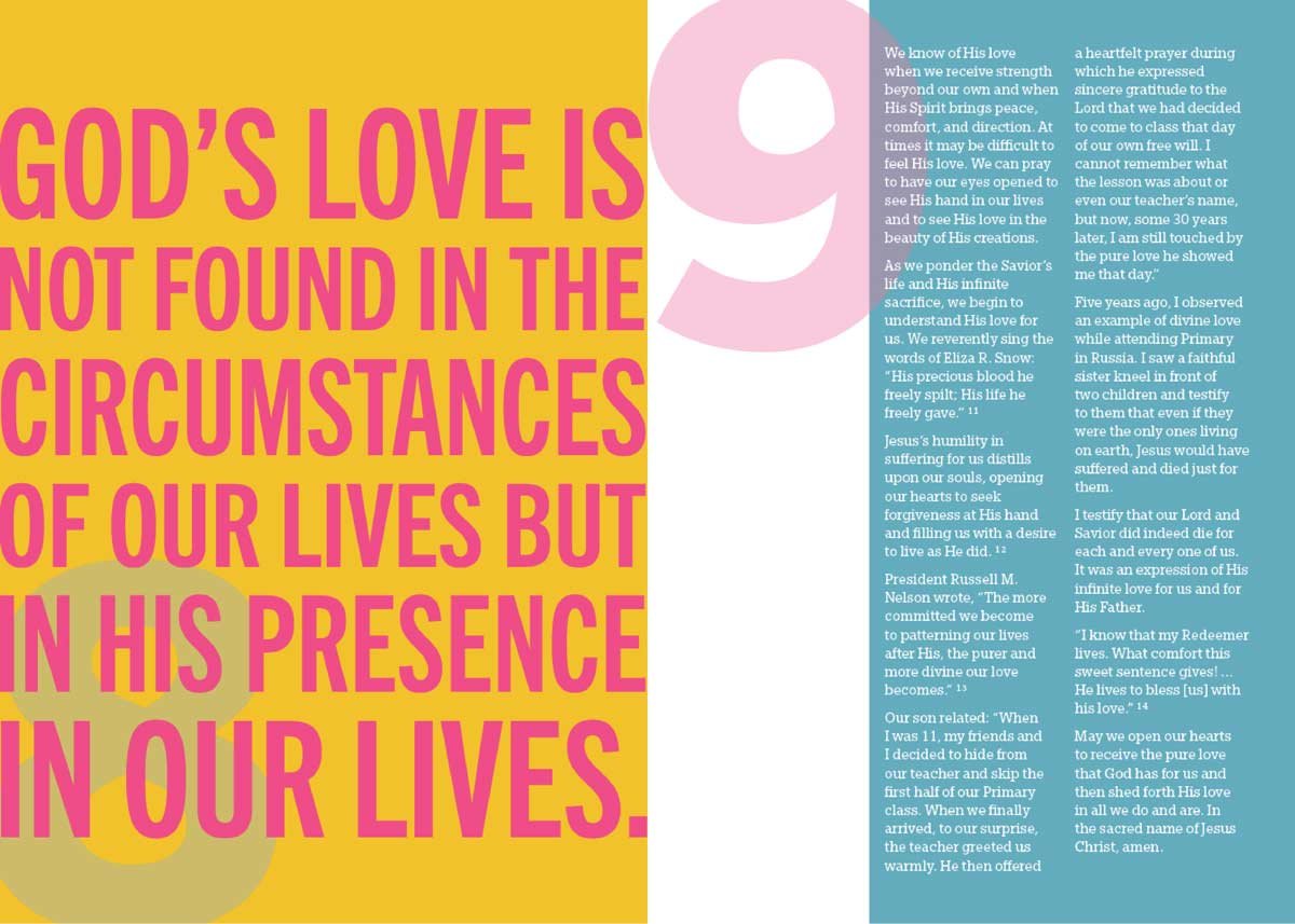
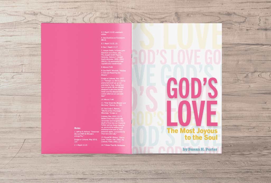
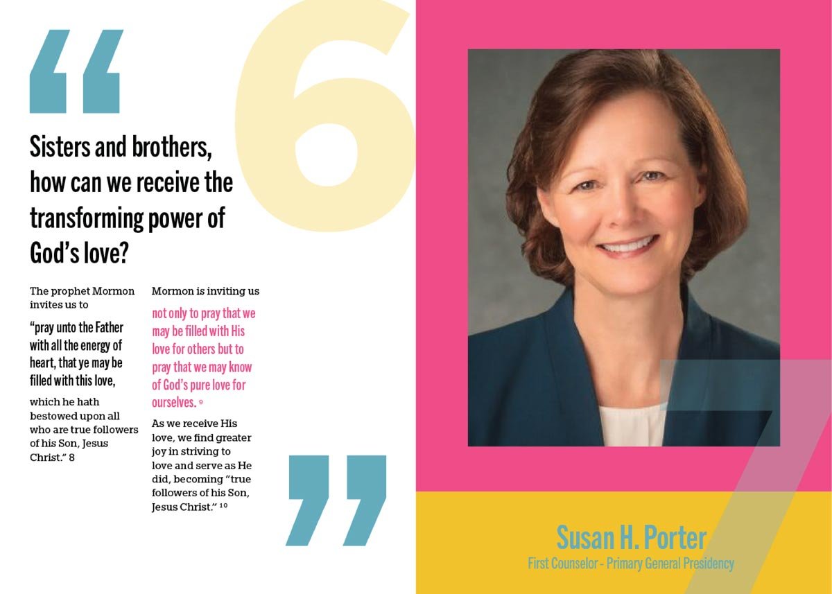
I chose a three column grid throughout the booklet with bold colors and oversized transparent page numbers to fit with the playful design.
The remaining spreads use the main colors in a variety of ways but stay consistent to the three column grid and style of the rest of the book.
